incubator-autocomplete - Vaadin Add-on Directory
The Web Component with a text input and a panel of suggested options.
 ](https://vaadin.com/directory/component/vaadinincubator-autocomplete)
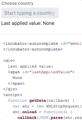
## Example Usage
```html
](https://vaadin.com/directory/component/vaadinincubator-autocomplete)
## Example Usage
```html
License
Issue tracker
View on GitHub
incubator-autocomplete version 1.0.0
### Dependencies
* polymer#^2.0.0
* vaadin-themable-mixin#vaadin/vaadin-themable-mixin#^1.0.0
* vaadin-element-mixin#vaadin/vaadin-element-mixin#^1.0.1
* vaadin-license-checker#vaadin/license-checker#^2.0.1
* vaadin-lumo-styles#vaadin/vaadin-lumo-styles#^1.0.0
* vaadin-dialog#vaadin/vaadin-dialog#^2.0.2
* vaadin-button#^2.0.1
* vaadin-text-field#^2.0.1
* vaadin-overlay#^3.0.3
* vaadin-list-box#^1.0.2
* vaadin-icons#^4.1.4
* iron-resizable-behavior#^2.1.1
incubator-autocomplete version 1.0.1
### Dependencies
* polymer#^2.0.0
* vaadin-themable-mixin#vaadin/vaadin-themable-mixin#^1.0.0
* vaadin-element-mixin#vaadin/vaadin-element-mixin#^1.0.1
* vaadin-license-checker#vaadin/license-checker#^2.0.1
* vaadin-lumo-styles#vaadin/vaadin-lumo-styles#^1.0.0
* vaadin-dialog#vaadin/vaadin-dialog#^2.0.2
* vaadin-button#^2.0.1
* vaadin-text-field#^2.0.1
* vaadin-overlay#^3.0.3
* vaadin-list-box#^1.0.2
* vaadin-icons#^4.1.4
* iron-resizable-behavior#^2.1.1
incubator-autocomplete version 1.0.2
### Dependencies
* polymer#^2.0.0
* vaadin-themable-mixin#vaadin/vaadin-themable-mixin#^1.0.0
* vaadin-element-mixin#vaadin/vaadin-element-mixin#^1.0.1
* vaadin-license-checker#vaadin/license-checker#^2.0.1
* vaadin-lumo-styles#vaadin/vaadin-lumo-styles#^1.0.0
* vaadin-dialog#vaadin/vaadin-dialog#^2.0.2
* vaadin-button#^2.0.1
* vaadin-text-field#^2.0.1
* vaadin-overlay#^3.0.3
* vaadin-list-box#^1.0.2
* iron-resizable-behavior#^2.1.1
incubator-autocomplete version 1.0.3
### Dependencies
* polymer#^2.0.0
* vaadin-themable-mixin#vaadin/vaadin-themable-mixin#^1.0.0
* vaadin-license-checker#vaadin/license-checker#^2.0.1
* vaadin-lumo-styles#vaadin/vaadin-lumo-styles#^1.0.0
* iron-resizable-behavior#^2.1.1
* vaadin-element-mixin#^2.1.1
* vaadin-text-field#^2.1.1
* vaadin-button#^2.1.0
* vaadin-list-box#^1.1.0
* vaadin-overlay#^3.1.1
incubator-autocomplete version 1.1.0
### Dependencies
* polymer#^2.0.0
* vaadin-themable-mixin#vaadin/vaadin-themable-mixin#^1.0.0
* vaadin-license-checker#vaadin/license-checker#^2.0.1
* vaadin-lumo-styles#vaadin/vaadin-lumo-styles#^1.0.0
* iron-resizable-behavior#^2.1.1
* vaadin-element-mixin#^2.1.1
* vaadin-text-field#^2.1.1
* vaadin-button#^2.1.0
* vaadin-list-box#^1.1.0
* vaadin-overlay#^3.1.1