vcf-popup - Vaadin Add-on Directory
popup that can be bound to element
# <vcf-popup>
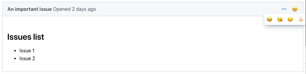
<vcf-popup> is a Web Component providing an easy way to hide extra content from your webpage and show them to the user whenever they need them.
 ## Example Usage
```html
## Example Usage
```html
```
[Live Demo ↗](https://incubator.app.fi/vcf-popup-demo/)
License
## Example Usage
```html
Online Demo
View on GitHub
View on NPM
vcf-popup version 1.0.2
### Dependencies
* @polymer/iron-icon#^3.0.1
* @polymer/iron-media-query#^3.0.1
* @polymer/polymer#^3.0.0
* @vaadin/vaadin-button#^2.2.1
* @vaadin/vaadin-element-mixin#^2.1.3
* @vaadin/vaadin-icons#^4.3.1
* @vaadin/vaadin-lumo-styles#^1.5.0
* @vaadin/vaadin-overlay#^3.2.14
* @vaadin/vaadin-themable-mixin#^1.4.4
vcf-popup version 1.1.0
### Dependencies
* polymer#^2.0.0
* vaadin-themable-mixin#vaadin/vaadin-themable-mixin#^1.0.0
* vaadin-element-mixin#vaadin/vaadin-element-mixin#^1.0.1
* vaadin-license-checker#vaadin/license-checker#^2.0.1
* vaadin-lumo-styles#vaadin/vaadin-lumo-styles#^1.0.0
* vaadin-overlay#^3.0.4
* iron-media-query#^2.1.0