Directory

← Back

Toggle Button Group

Toggle-Button-Group for Vaadin 23.3+ and Java 17+

Author

Rating

Popularity

500+

This component provides a group of toggleable buttons for single selection among the provided generic objects.

It has API for:

  • Enabling/Disabling the whole component
  • Making it read-only (default: editable)
  • Changing buttons to be not toggleable (default: toggleable)
  • Setting the Horizontal or Vertical orientation (default: Horizontal)
  • Setting any generic objects as items
  • Setting label and tooltip for the component
  • Support for adding value change listeners

And customizing the buttons in a functional way by:

  • Providing item enabled provider
  • Providing item label generator
  • Providing selected item styling class generator
  • Providing item icon generator
  • Providing item tooltip generator
  • Providing item custom identity provider
  • Providing item custom order provider for presentation (preserves the order of the original items as well)

This component follows the Lumo themeing styles, so any customizations to the theme will conveniently affect this component as well.

Compatibility

(Loading compatibility data...)

Was this helpful? Need more help?
Leave a comment or a question below. You can also join the chat on Discord or ask questions on StackOverflow.

Version

  • Upgrade to vaadin 24.2.0
  • Prevent NPE when oldSelected is null #6

Special thanks to @simasch for the bug fix contribution.

Released
2023-10-18
Maturity
STABLE
License
Apache License 2.0

Compatibility

Framework
Vaadin 24
Vaadin 24.1
Vaadin 24.2
Vaadin 23 in 1.0.0
Browser
Browser Independent

Toggle Button Group - Vaadin Add-on Directory

Toggle-Button-Group for Vaadin 23.3+ and Java 17+ Toggle Button Group - Vaadin Add-on Directory
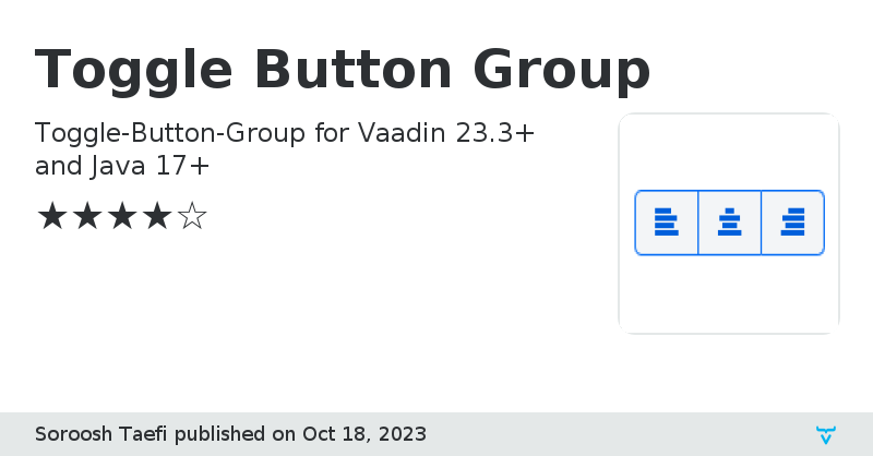
This component provides a group of toggleable buttons for single selection among the provided generic objects. It has API for: - Enabling/Disabling the whole component - Making it read-only (default: editable) - Changing buttons to be not toggleable (default: toggleable) - Setting the Horizontal or Vertical orientation (default: Horizontal) - Setting any generic objects as items - Setting label and tooltip for the component - Support for adding value change listeners And customizing the buttons in a functional way by: - Providing item enabled provider - Providing item label generator - Providing selected item styling class generator - Providing item icon generator - Providing item tooltip generator - Providing item custom identity provider - Providing item custom order provider for presentation (preserves the order of the original items as well) This component follows the Lumo themeing styles, so any customizations to the theme will conveniently affect this component as well.
Online