Directory

← Back

confirm-element

(no summary available)

Author

Rating

Popularity

<100

License - MIT Published on NPM Published on Vaadin  Directory

<confirm-element>

Description.

confirmation window with two buttons and editable icons

Installation

npm install confirm-element"@0.0.1"

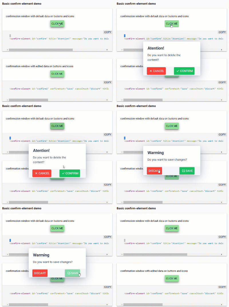
Screenshot of confirm-element

Configuration :

  • Use open to show the window.
  • Use title to add title.
  • Use message to add the body of the message to be displayed.
  • Use confirmtext add text to the confirmation button.
  • Use canceltext add text to the cancel button
  • Use icon for the visibility of the icons, default value false.
  • Use iconcancel and iconconfirm to add the icons to each button correspondingly, the available icons correspond to the portfolio of VAADIN ICONS, default values lumo:cross and lumo:checkmark, if you prefer buttons without icon: iconconfirm="none" or iconcancel="none"

Events

cancel: CustomEvent the cancel event is activated by pressing the cancel button or the ESC key.

confirm: CustomEvent
the event is activated by pressing the confirm button

<confirm-element 
    open
    title="Warming"
    message="Do you want to save changes?" 
    confirmtext="Save" 
    canceltext="Discart" 
    icon 
    iconcancel="none" 
    iconconfirm="lumo:edit"
></confirm-element>

Usage

In an html file

<html>
  <head>
    <script type="module">
      import '.././confirm-element.js';
    </script>
  </head>
  <body>

    <confirm-element 
      id="showconfirm" 
      confirmtext="OK" 
      canceltext="Cancel" 
      title="Close"
      message="Are you sure you want to close this window?" 
      icon iconcancel="none" 
      iconconfirm="lumo:checkmark"
    ></confirm-element>

  </body>
</html>

In a Polymer 3 element

import {PolymerElement, html} from '@polymer/polymer';
import '.././confirm-element.js';

class SampleElement extends PolymerElement {
  static get template() {
    return html`

        <confirm-element 
            id="showconfirm" 
            title="Close"
            message="Are you sure you want to close this window?" 
            confirmtext="OK" 
            canceltext="Cancel" 
            icon 
            iconcancel="none" 
            iconconfirm="lumo:checkmark"
        ></confirm-element>
    `;
  }
  ready(){
      this.message = this.$.showconfirm;
      this.message.addEventListener('confirm', () => this.confirmDialog());
  }
  confirmDialog(){
      ............
  }
}
customElements.define('sample-element', SampleElement);

License

MIT License

Compatibility

(Loading compatibility data...)

Was this helpful? Need more help?
Leave a comment or a question below. You can also join the chat on Discord or ask questions on StackOverflow.

Version

Dependencies

  • @polymer/iron-icon#^3.0.1
  • @polymer/paper-button#^3.0.1
  • @polymer/polymer#^3.0.0
  • @vaadin/vaadin-dialog#^2.2.1
Released
2019-03-25
Maturity
IMPORTED
License
MIT License

Compatibility

Framework
Polymer 3.0+
Browser
Browser Independent

confirm-element - Vaadin Add-on Directory

(no summary available) confirm-element - Vaadin Add-on Directory
![License - MIT](https://img.shields.io/github/license/dacelisl/confirm-element.svg) [![Published on NPM](https://img.shields.io/badge/NPM-Published-red.svg)](https://www.npmjs.com/package/confirm-element) [![Published on Vaadin Directory](https://img.shields.io/badge/Vaadin%20Directory-published-00b4f0.svg)](https://vaadin.com/directory/component/dacelislconfirm-element) # \ ## Description. confirmation window with two buttons and editable icons ## Installation `npm install confirm-element"@0.0.1"` ![Screenshot of confirm-element](https://raw.githubusercontent.com/Dacelisl/confirm-element/master/confirm-element.gif) ### Configuration __: * Use **open** to show the window. * Use **title** to add title. * Use **message** to add the body of the message to be displayed. * Use **confirmtext** add text to the confirmation button. * Use **canceltext** add text to the cancel button * Use **icon** for the visibility of the icons, default value false. * Use **iconcancel** and **iconconfirm** to add the icons to each button correspondingly, the available icons correspond to the portfolio of [VAADIN ICONS](https://cdn.vaadin.com/vaadin-lumo-styles/1.4.2/demo/icons.html), default values *lumo:cross* and *lumo:checkmark*, if you prefer buttons without icon: *iconconfirm="none"* or *iconcancel="none"* ### Events **cancel**: *CustomEvent* the cancel event is activated by pressing the cancel button or the ESC key. **confirm**: *CustomEvent* the event is activated by pressing the confirm button ```html ``` ## Usage ### In an html file ```html ``` ### In a Polymer 3 element ```js import {PolymerElement, html} from '@polymer/polymer'; import '.././confirm-element.js'; class SampleElement extends PolymerElement { static get template() { return html` `; } ready(){ this.message = this.$.showconfirm; this.message.addEventListener('confirm', () => this.confirmDialog()); } confirmDialog(){ ............ } } customElements.define('sample-element', SampleElement); ``` ## License MIT License
View on NPM
View on GitHub

confirm-element version 0.0.1
### Dependencies * @polymer/iron-icon#^3.0.1 * @polymer/paper-button#^3.0.1 * @polymer/polymer#^3.0.0 * @vaadin/vaadin-dialog#^2.2.1

confirm-element version 0.0.2
### Dependencies * @polymer/iron-icon#^3.0.1 * @polymer/paper-button#^3.0.1 * @polymer/polymer#^3.0.0 * @vaadin/vaadin-dialog#^2.2.1

Online