CircularProgressBar Flow - Vaadin Add-on Directory
Circular shaped progress indicator for Vaadin 24, Vaadin 23.3.x and Vaadin 14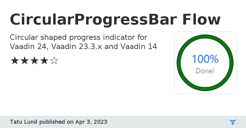
### Overview
This is a circular shaped progress indicator made as web component using Svg.
This add-on is inspired by https://vaadin.com/directory/component/circular-progressbar-add-on1
### Features:
- Configurable border
- Optional caption
- Animated and non-animated modes
- Configurable animation speed
- Implements HasTooltip
### Styling with CSS custom properties, use integer numbers
- --progress-circle-width
- --progress-caption-font-size
- --progress-percent-font-size
Online DemoView on GitHub
CircularProgressBar Flow version 1.0.0
### Version 1.0.0
- Initial version
CircularProgressBar Flow version 1.1.0
### Version 1.1.0
- Added API to control animation
CircularProgressBar Flow version 1.2.0
### Version 1.2.0
- Added API to set border
- Parametrized some things with CSS custom properties for easier styling
CircularProgressBar Flow version 1.3.0
### Version 1.3.0
- Implement HasTooltip, requires Vaadin 23.3.0
CircularProgressBar Flow version 0.1.0
### Version 0.1.0
- V14 backport
CircularProgressBar Flow version 1.3.1
### Version 1.3.1
- Fix issue with client side exception
- Tested with Vaadin 24 as well
CircularProgressBar Flow version 1.3.2
### Version 1.3.2
- Fix broken tooltips with Vaadin 24