jellySwitch - Vaadin Add-on Directory
Jellified Light weight switch web component built on vanilla javascript
[](https://www.webcomponents.org/element/jelly-switch) 


# jelly-switch
A simple, customizable and jellified switch built as web component using ES6 javascript
### NOTE:
- This component is still in work in progress *WIP*. So there is a high chance that the API can change. So please be notified
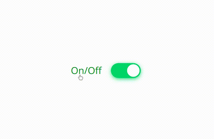
This micro web component(~1.7kB) can be used for any framework
# Try Now
Play with the component
[](https://codesandbox.io/s/ryl1qzxn0m)
# Install
### 1. via npm
```
npm i jelly-switch
```
(or)
### 2.via script tag
```html
```
# Usage
### 1.Import into module script(required only for npm install):
```javascript
import { JellySwitch } from "jelly-switch"
```
### 2.Use it in your web page like any other HTML element
```html
```
# API
## Attributes
- `checked`
Add this attribute to set the switch to toggled / checked mode i.e., equivalent to 'checked' attribute of input type
```html
```
(or)
```javascript
js1.checked = true
```
- `disabled`
Add this attribute to disable the switch and the opacity will be decreased to half and user can not interact with the switch and cursor will be changed to 'not-allowed'
```html
```
(or)
```javascript
js1.disabled = true;
```
## Slots
- For achieving the `label` binding with the `input` by `for` attribute, `slot` feature has been used in this custom element
- For label to position to left of the `jelly-switch` , slot attribute with the value `content-left` can be used for any other native HTML Element as shown in the example below
```html
```
- For label to position to right of the `jelly-switch` , slot attribute with the value `content-right` can be used for any other native HTML Element as shown below
```html
```
| Slot name | Description | Image |
|-----------|-------------|-------|
|`content-left`| This would render the label to left of the switch ||
|`content-right`| This would render the label to right of the switch |
## Styling
The switch component can be styled as a normal and regular HTML element in CSS. There are list of CSS properties below with the default values
| CSS variables | Default value | Description |
|---------------|---------------|-------------|
|`--off-color ` | #FF4651 | background color of switch when the switch is off or its value is set to false. Can assign any color to rgba, hex values |
|`--on-color ` | #11C75D | background color of switch when the switch is on or its value is set to true. Can assign any color to rgba, hex values |
|`--onHandle-color ` | #FFFFFF | color of switch Handle when the switch is on or its value is set to true. Can assign any color to rgba, hex values |
|`--offHandle-color ` | #FFFFFF | color of switch Handle when the switch is off or its value is set to false. Can assign any color to rgba, hex values |
The CSS variables can be set dynamically. For example, refer the following snippet
```javascript
document.documentElement.style.setProperty('--off-color', 'rgba(25,89,79,0.7');
```
## Events
- `toggle`
- The toggle event is triggered when the user toggles the switches either by
- clicking on the switch (or)
- pressing `space` on the keyboard when the switch is focused
- The present value can be accessed from `event.detail.value` as shown in the below example
```javascript
document.documentElement.addEventListener('toggle',handleToggle(e));
```
or
```html
View on GitHubOn/Off
On/Off
On/Off
View on NPM
jellySwitch version 0.1.0
### Dependencies
jellySwitch version 0.1.1
### Dependencies
jellySwitch version 0.1.2
### Dependencies
jellySwitch version 0.1.2-s
### Dependencies
jellySwitch version 0.1.3
### Dependencies
jellySwitch version 0.1.4
### Dependencies
jellySwitch version 0.1.5
### Dependencies
jellySwitch version 0.2.0
### Dependencies
jellySwitch version 0.2.1
### Dependencies
jellySwitch version 0.2.2
### Dependencies
jellySwitch version 0.2.3
### Dependencies