Design System Publisher

Publish & share your Design System

Create a custom design system complete with a documentation website
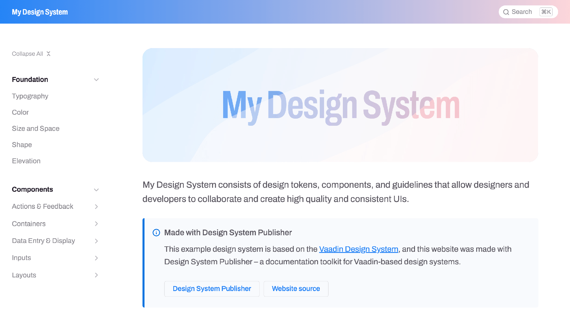
ds-publisher
Easy documentation

Keep track of available UI features

Documentation is an essential part of a design system, as it helps team members keep track of the available UI features and use them as a basis for all their design and implementation work.

Design System

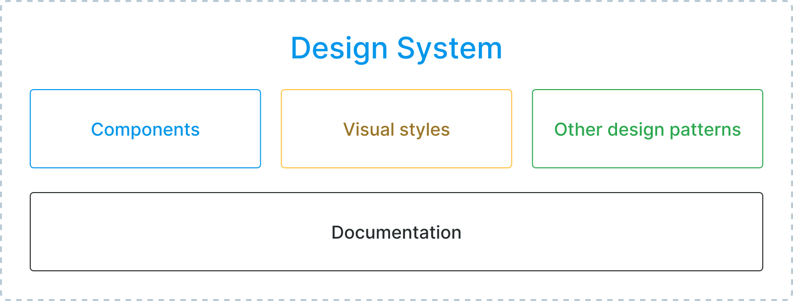
A design system is a standardized set of UI features and design patterns, such as components, layouts, and visual styles, that form the foundation for an application’s UI. Design systems help teams deliver a consistent, high-quality user experience with increased code reuse, shorter time-to-market and lower total cost of ownership. Read more about design systems and their benefits.

Design System Publisher is available for Prime and Enterprise subscribers. If you are already subscribed and need help with getting started, contact our experts through Expert Chat.

No subscription? Start a free trial.

Features

Publish your Design System documentation in no time

You can publish a documentation website easily thanks to all the automated features of Design System Publisher

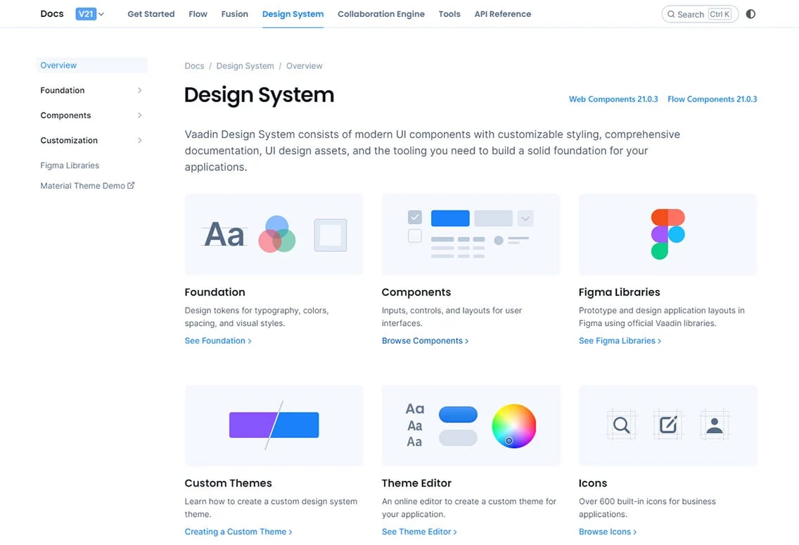
Use the Vaadin Design System documentation as a starting point

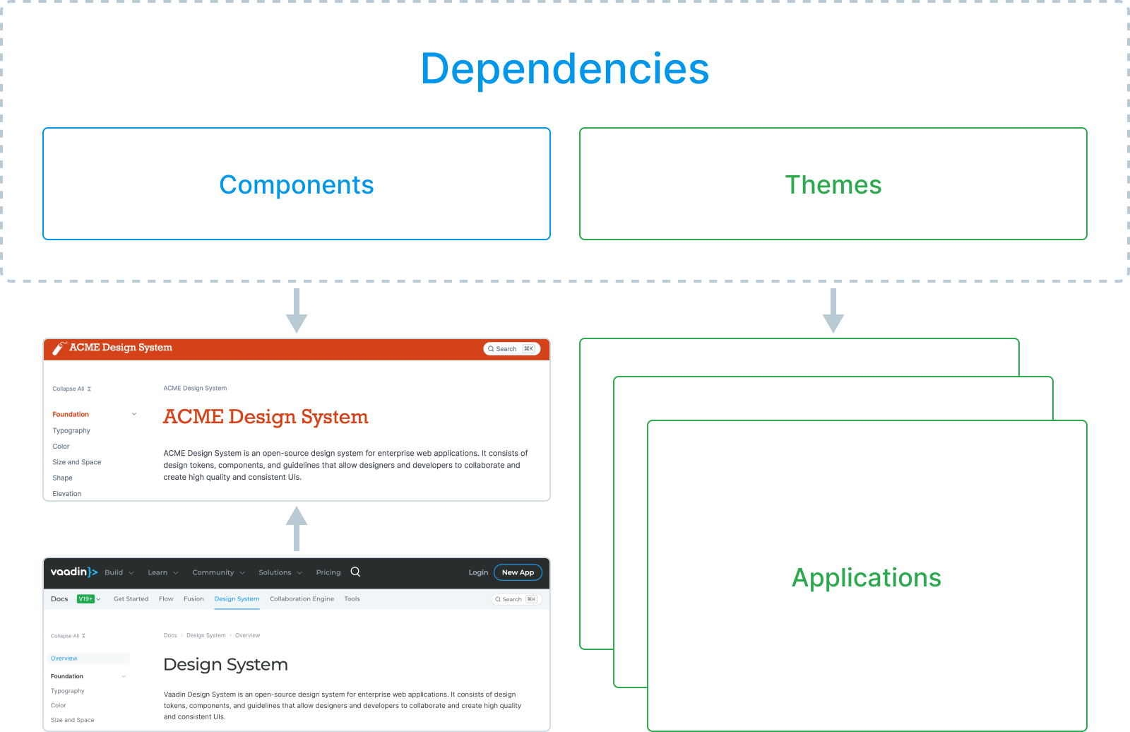
The installer provides you with a copy of the Vaadin Design System documentation as a starting point so you don’t have to write all documentation from scratch. Simply customize and extend it with your own theme, components, and documentation.

Updates to the Vaadin Design System can be merged into your own documentation using Git.

ds-docs

Add your theme and components as dependencies

Packaging your theme and components into dependencies allows them to be used in the documentation website and multiple Vaadin applications without duplication.

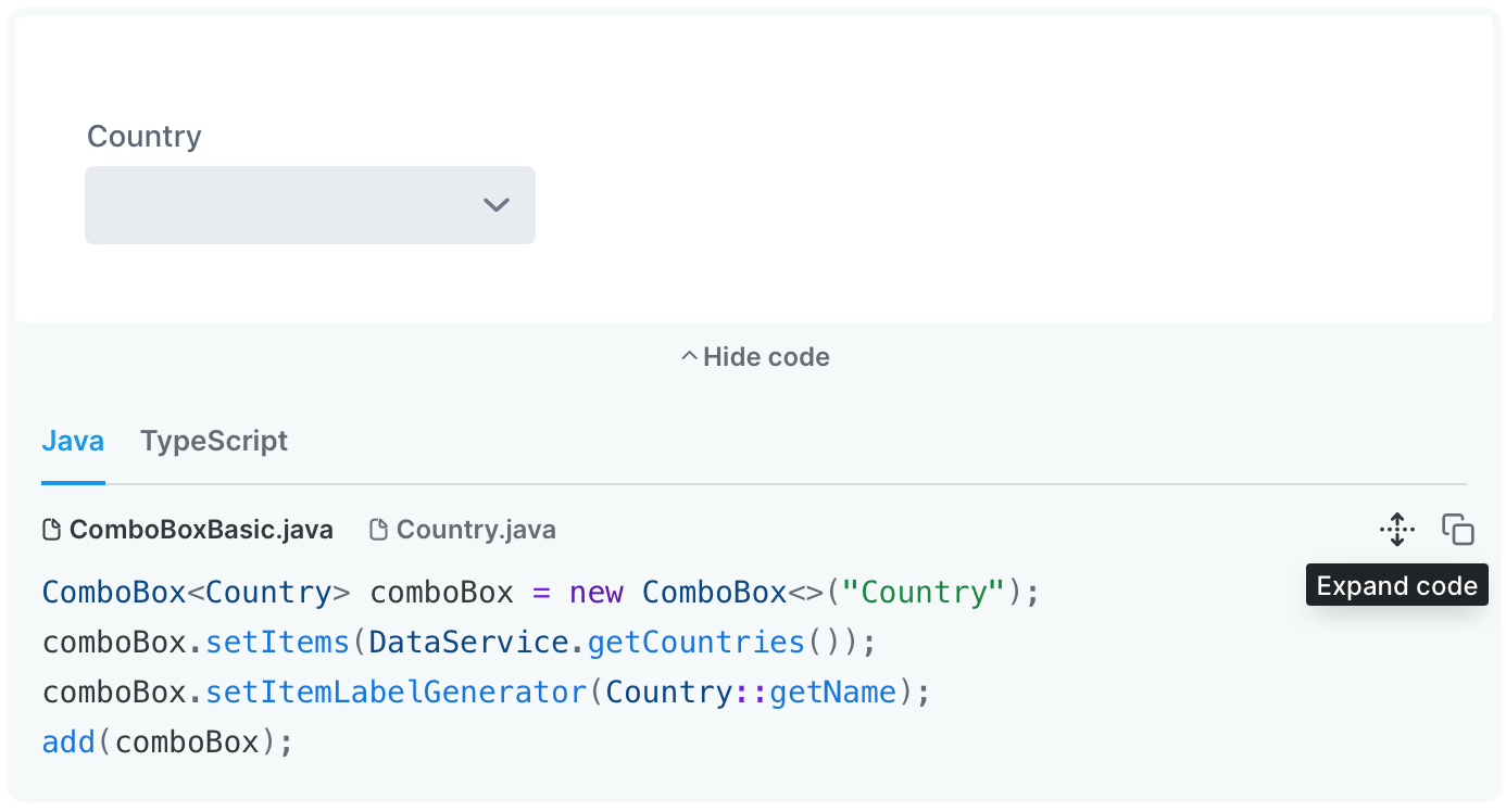
Write documentation in the AsciiDoc markdown format

AsciiDoc is a human-readable mark-up format with a simple syntax for formatting text and embedding content and code snippets, which Design System Publisher compiles into web pages.
    Date Field
// tag::description[]
A composite date input field with separate sub-fields for day, month and year.
// end::description[]

=== Read-only
Use read-only when content needs to be accessible but not editable. Read-only elements cannot be edited, but they do participate in the tabbing order and can thus receive focus. The contents of a read-only input can be selected and copied.
  

Live, interactive Java and Web Component samples

Live components and code samples can be easily embedded into the documentation. Both Java (Flow) and TypeScript-based components are supported.
Documentation in 8 steps

Create your own UI documentation website in 8 easy steps

Simply follow these steps to publish your Design System documentation.

1. Create a custom theme

Create a new reusable theme and add your style tokens and custom CSS into it, as described in the tutorial
    my-theme
├── components/
├── images/
├── fonts/
└── styles.css
  

2. Package and Deploy Your Theme and Components

Export the theme and your custom components either as separate packages or into a single JAR file, and deploy them into your local Maven repository.
    mvn install -DartifactId=my-design-system
  

3. Initialize a New Documentation Website Project

Run the command to initialize a new documentation website project, bundled with the Vaadin Design System documentation as a starting point.
    npx @vaadin/cli dsp-init
  

4. Add Theme and Component Dependencies

Add your theme and component dependencies to the documentation website project’s pom.xml.
    <dependency>
  <groupId>com.my-org</groupId>
  <artifactId>my-design-system</artifactId>
</dependency>
  

5. Write Your Own Content

Add documentation pages and UI samples with code snippets for your custom components and tweak default Vaadin content to match your own UI standards.
    = Date Field

// tag::description[]
A composite date input field with separate sub-fi month and year.
// end::description[]
  

6. Brand the Website

Adjust the styling of the website itself to match your own brand by tweaking a few CSS variables.
    --docs-font-family: ‘Inter’;
--docs-header-background-color: orange;
--docs-heading-text-color: orange;
  

7. Start It Up!

Make a development build and run the website locally.
    npm run dspublisher:start
  

8. Deploy to Production

Finally, when you’re happy with the initial content, you can make a production build and deploy the website to your organization’s server and let your team start designing and developing.
    npm run dspublisher:build
  
No active Prime or Enterprise subscription? Start a free trial.

Have questions?

If you have questions, please browse the documentation or contact us directly to learn more!