Chapter 17. Vaadin Timeline
Table of Contents
Vaadin Timeline is an add-on component that gives the user an intuitive understanding of events and trends. A timeline consists of a time-axis depicting a desired time range and some events or values mapped to the time range.
A timeline allows representing time-related data visually as graphs instead of numerical values. They are used commonly in almost all fields of business, science, and technology, such as in project management to map out milestones and goals, in geology to map out historical events, and perhaps most prominently in the stock market.
With Vaadin Timeline, you can represent almost any time-related statistical data that has a time-value mapping. Even several data sources can be used for comparison between data. This allows the user to better grasp of changes in the data and antipate forthcoming trends and problems.
Vaadin Timeline can be easily included in a Vaadin application and is highly customizable to suit almost any purpose. Timeline supports multiple graph types as well as events and markers. The user interaction with the Timeline is straight-forward and simple.
Book of Vaadin currently includes only an introduction to Vaadin Timeline. Please refer to the product documentation included in the installation package for further details.
Vaadin Timeline is a commercial product licensed under a dual-licensing scheme. The AGPL (GNU Affero General Public License) allows open-source development. CVAL (Commercial Vaadin Add-On License) needs to be purchased for closed-source use, including web deployments as well as intranet use.
Commercial licenses can be purchased from the Vaadin Directory, where you can also find the license details and download the Vaadin Timeline.
The Vaadin Timeline supports three graph types:
- Line graphs
- Useful for representing continuous data, such as temperature changes or changes in stock price.
- Bar graphs
- Useful for representing discrete or discontinuous data, such as market share or forum posts.
- Scatter graphs
- Useful for representing discrete or discontinuous data.
If you have several graphs in the timeline, you can also stack them on top
of each other instead of drawing them on top of each other by setting
setGraphStacking() in
Timeline to true.
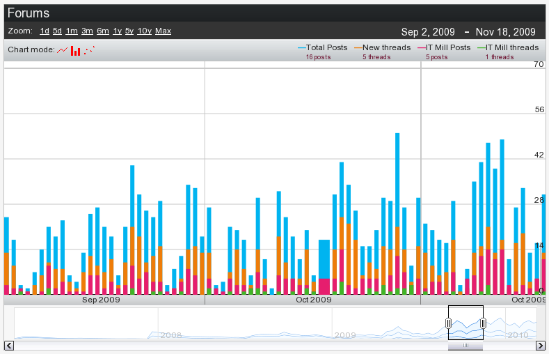
The user can interact with the Vaadin Timeline in several ways.
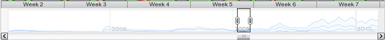
On the bottom of the timeline there is a scrollbar area where you can move the time forward or backward in time by dragging the time range box or by clicking the left and right arrow buttons. You can change the time range by resizing the range box in the scrollbar area. You can also zoom with the mouse wheel when the pointer is inside the component.
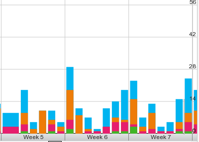
The middle area of the timeline is the main area where the selected time range is displayed. Time scale is shown below the main area. The time scale used depends on the zoom level and can be a time unit from hours to years. Value scale is displayed on the right side of the main area. The scale can be either a static value range or a range calculated from the displayed data set. The user can move in time by dragging the main area with the mouse left and right and zoom in and out by using the mouse wheel.
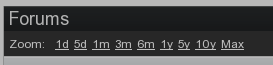
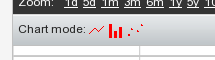
You can select a preset zoom level with the buttons on the top the Timeline. This will change the displayed time range to match the zoom level. The zoom levels are fully customizable to suit the time range in the API.
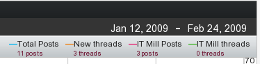
The current time range is shown at the top-right corner of the component. Clicking the dates makes them editable, so that you can manually change them. Graph legend is shown below the time range. The legend explains what is represented by each bar on the graph and displays the current value when the user moves the mouse cursor over the graph.
Finally, the available chart modes are shown below the preset zoom levels options. The available graph modes can be set from the API.
You can use or hide any of the features above can be shown or hidden depending on your needs. For example, if you only need to display a graph without any controls, you can hide all them from the API.
In addition to graphs, the timeline can have events. An event can be, for example, the time of a published advertisement in a graph that displays website hits. Combining the event data with the graphs enables the user to observe the relevance of the advertisement to the website hits visually.
Vaadin Timeline provides two types of event markers, as illustrated in Figure 17.7, “Timeline Event Markers”.
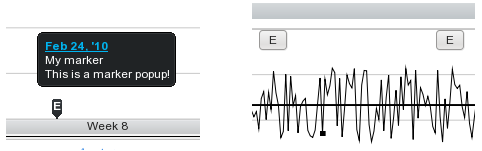
(On left) Marker with a customizable marker sign, for example, letter 'E'. The marker displays a caption which appears when the user hovers the pointer over the event.
(On right) Marker with button-like appearance with a marker sign and a caption.
Vaadin Timeline reduces the traffic between the server and the client by using two methods.
First of all, all the data that is presented in the component is dynamically fetched from the server as needed. This means that when the user scrolls the timeline view, the component continuously fetches data from the server. Also, only data that is visible to the user is transferred to the client. For example, if the timeline has data that has been measured once a second for an entire year, not all the data will be sent to the client. Only the data which can be rendered on the screen without overlapping is sent. This ensures that, even for large data sets, the loading time is small and only the necessary data is actually transferred over the network.
Second, Vaadin Timeline caches the data received from the server in the browser, so that the data is transferred over the network only once, if possible. This speeds up the time-range browsing when data can be fetched from the cache instead of reloading it over the network.