6.9. Accordion
Accordion is a multicomponent container similar to
TabSheet, except that the "tabs" are arranged
vertically. Clicking on a tab opens its contained component in the space
between the tab and the next one. You can use an
Accordion identically to a
TabSheet, which it actually inherits. See Section 6.8, “TabSheet” for more information.
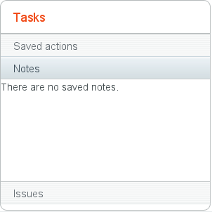
The following example shows how you can create a simple accordion. As the
Accordion is rather naked alone, we put it inside a
Panel that acts as its caption and provides it a border.
// Create the Accordion.
Accordion accordion = new Accordion();

// Have it take all space available in the layout.
accordion.setSizeFull();

// Some components to put in the Accordion.
Label l1 = new Label("There are no previously saved actions.");
Label l2 = new Label("There are no saved notes.");
Label l3 = new Label("There are currently no issues.");

// Add the components as tabs in the Accordion.
accordion.addTab(l1, "Saved actions", null);
accordion.addTab(l2, "Notes", null);
accordion.addTab(l3, "Issues", null);

// A container for the Accordion.
Panel panel = new Panel("Tasks");
panel.setWidth("300px");
panel.setHeight("300px");
panel.addComponent(accordion);

// Trim its layout to allow the Accordion take all space.
panel.getLayout().setSizeFull();
panel.getLayout().setMargin(false);
Figure 6.14, “An Accordion” shows what the example would look like with the default theme.
.v-accordion {}
.v-accordion-item {}
.v-accordion-item-open {}
.v-accordion-item-first {}
.v-accordion-item-caption {}
.v-accordion-item-caption .v-caption {}
.v-accordion-item-content {}
The top-level element of Accordion has the
v-accordion style. An Accordion
consists of a sequence of item elements, each of which has a caption
element (the tab) and a content area element.
The selected item (tab) has also the v-accordion-open
style. The content area is not shown for the closed items.