5.23. Component Composition with CustomComponent
The ease of making new user interface components is one of the core features of Vaadin. Typically, you simply combine existing built-in components to produce composite components. In many applications, such composite components make up the majority of the user interface.
To create a composite component, you need to inherit the
CustomComponent and call the
setCompositionRoot() in the constructor to set the
composition root component. The root component is
typically a layout component that contains multiple components.
For example:
class MyComposite extends CustomComponent {
    public MyComposite(String message) {
        // A layout structure used for composition
        Panel panel = new Panel("My Custom Component");
        panel.setContent(new VerticalLayout());

        // Compose from multiple components
        Label label = new Label(message);
        label.setSizeUndefined(); // Shrink
        panel.addComponent(label);
        panel.addComponent(new Button("Ok"));

        // Set the size as undefined at all levels
        panel.getContent().setSizeUndefined();
        panel.setSizeUndefined();
        setSizeUndefined();

        // The composition root MUST be set
        setCompositionRoot(panel);
    }
}
Take note of the sizing when trying to make a customcomponent that shrinks to fit the contained components. You have to set the size as undefined at all levels; the sizing of the composite component and the composition root are separate.
You can use the component as follows:
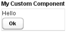
MyComposite mycomposite = new MyComposite("Hello");
The rendered component is shown in Figure 5.71, “A Custom Composite Component”.
You can also inherit any other components, such as layouts, to attain similar composition. Even further, you can create entirely new low-level components, by integrating custom Google Web Toolkit components or by extending the client-side functionality of built-in components. Development of custom GWT components is covered in Chapter 11, Developing New Components.