5.12. CheckBox
CheckBox is a two-state selection component that can be
either checked or unchecked. The caption of the check box will be placed right
of the actual check box. Vaadin provides two ways to create check boxes:
individual check boxes with the CheckBox component
described in this section and check box groups with the
OptionGroup component in multiple selection mode, as
described in Section 5.13.5, “Radio Button and Check Box Groups with OptionGroup”.
Clicking on a check box will change its state. The state is the
Boolean property of the Button,
and can be set with setValue() and obtained with
getValue() method of the
Property interface. Changing the value of a check box
will cause a ValueChangeEvent, which can be handled by
a ValueChangeListener.
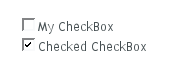
// A check box with default state (not checked, false).
final CheckBox checkbox1 = new CheckBox("My CheckBox");
main.addComponent(checkbox1);

// Another check box with explicitly set checked state.
final CheckBox checkbox2 = new CheckBox("Checked CheckBox");
checkbox2.setValue(true);
main.addComponent(checkbox2);

// Make some application logic. We use anonymous listener
// classes here. The above references were defined as final
// to allow accessing them from inside anonymous classes.
checkbox1.addListener(new ValueChangeListener() {
    public void valueChange(ValueChangeEvent event) {
        // Copy the value to the other checkbox.
        checkbox2.setValue(checkbox1.getValue());
    }
});
checkbox2.addListener(new ValueChangeListener() {
    public void valueChange(ValueChangeEvent event) {
        // Copy the value to the other checkbox.
        checkbox1.setValue(checkbox2.getValue());
    }
});
For an example on the use of check boxes in a table, see Section 5.14, “Table”.