5.11. Button
The Button is a user interface component that is
normally used for finalizing input and initiating some action. When the user
clicks a button, a Button.ClickEvent is emitted. A
listener that inherits the Button.ClickListener
interface can handle clicks with the buttonClick()
method.
public class TheButton extends CustomComponent
implements Button.ClickListener {
Button thebutton;
public TheButton() {
// Create a Button with the given caption.
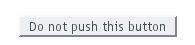
thebutton = new Button ("Do not push this button");
// Listen for ClickEvents.
thebutton.addListener(this);
setCompositionRoot(thebutton);
}
/** Handle click events for the button. */
public void buttonClick (Button.ClickEvent event) {
thebutton.setCaption ("Do not push this button again");
}
}
As a user interface often has several buttons, you can differentiate
between them either by comparing the Button
object reference returned by the getButton()
method of Button.ClickEvent to a kept
reference or by using a separate listener method for each button. The
listening object and method can be given to the constructor. For a
detailed description of these patterns together with some examples,
please see Section 3.5, “Events and Listeners”.
.v-button { }
The exact CSS style name can be different if a Button
has the switchMode attribute enabled. See the
alternative CSS styles below.
Adding the "small" style name enables a smaller style
for the Button. You can also use the
BUTTON_SMALL constant in
Runo and Reindeer theme
classes as well. The BaseTheme class also has a
BUTTON_LINK style, with "link"
style name, which makes the button look like a hyperlink.