Accordion
Accordion is a multicomponent container similar to TabSheet, except that the "tabs" are arranged vertically. Clicking on a tab opens its contained component in the space between the tab and the next one. You can use an Accordion identically to a TabSheet, which it actually inherits. See "TabSheet" for more information.
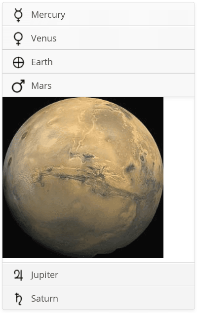
The following example shows how you can create a simple accordion. As the Accordion is rather naked alone, we put it inside a Panel that acts as its caption and provides it a border.
// Create the accordion
Accordion accordion = new Accordion();

// Create the first tab, specify caption when adding
Layout tab1 = new VerticalLayout(); // Wrap in a layout
tab1.addComponent(new Image(null, // No component caption
    new ThemeResource("img/planets/Mercury.jpg")));
accordion.addTab(tab1, "Mercury",
    new ThemeResource("img/planets/Mercury_symbol.png"));

// This tab gets its caption from the component caption
Component tab2 = new Image("Venus",
    new ThemeResource("img/planets/Venus.jpg"));
accordion.addTab(tab2).setIcon(
    new ThemeResource("img/planets/Venus_symbol.png"));

// And so forth the other tabs...
String[] tabs = {"Earth", "Mars", "Jupiter", "Saturn"};
for (String caption: tabs) {
    String basename = "img/planets/" + caption;
    VerticalLayout tab = new VerticalLayout();
    tab.addComponent(new Image(null,
            new ThemeResource(basename + ".jpg")));
    accordion.addTab(tab, caption,
            new ThemeResource(basename + "_symbol.png"));
}
An Accordion shows what the example would look like with the default theme.

CSS Style Rules
.v-accordion {}
  .v-accordion-item,
  .v-accordion-item-open,
  .v-accordion-item-first {}
    .v-accordion-item-caption {}
      .v-caption {}
    .v-accordion-item-content {}
      .v-scollable {}
The top-level element of Accordion has the v-accordion style. An Accordion consists of a sequence of item elements, each of which has a caption element (the tab) and a content area element.
The selected item (tab) has also the v-accordion-open style. The content area is not shown for the closed items.