11.3. Google Web Toolkit Widgets
Let us take a look into how you create custom GWT widgets. The authoritative sources for developing with GWT are the Google Web Toolkit Developer Guide and Google Web Toolkit Class Reference, both available from the GWT website.
Google Web Toolkit offers a variety of ways for creating custom widgets. The easiest way is to create composite widgets by grouping existing basic widgets and adding some interaction logic to them. You can also develop widgets using the lower-level Java interfaces used by the standard GWT widgets or the really low-level JavaScript interfaces.
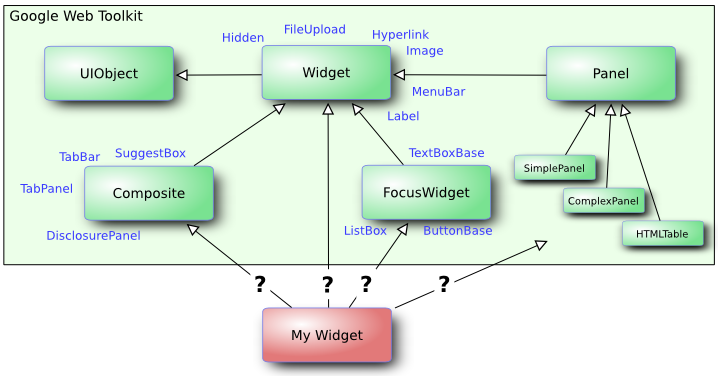
A custom GWT widget needs to find its place in the GWT class hierarchy. Figure 11.5, “GWT Widget Base Class Hierarchy” illustrates the abstract base classes for GWT widgets.
Each of the base classes offers various services for different types of
widgets. Many custom widgets, such as the Color Picker example below, extend
the Composite class to compose the widget from existing
GWT widgets. The other base classes offer various features useful for
different kinds of widgets. You can also choose to extend an existing GWT
widget, as we have done for most of the standard user interface components of
Vaadin, or to extend a Vaadin widget.
Extending an existing Vaadin widget is an easy way to add features, such as advanced client-side validation, to existing standard components. Just extend both the server-side component and the client-side widget, and add the needed properties and other functionality.
A few guidelines apply for extending existing components:
- Do not redefine the
clientoridmember variables in the subclass. They should always be defined asprotectedand set by the base class where they are defined inupdateFromUIDL(). - Call
super()as the first thing in the constructor. - In
updateFromUIDL():- Do not call
client.updateComponent()as it is already called in the superclass. If the superclass calls it in an undesired way, you have to reimplement the entire functionality and not callsuper.updateFromUIDL()at all. - Call
super.updateFromUIDL(uidl,
                        client)
, unless you specifically want to change the behaviour of the superclass implementation of the method. In such case, you have to set theclientandidyourself.
- Do not call
- Be careful about overloading superclass handlers, etc.
In the following example, we present a custom widget composited from the
HorizontalPanel, Grid,
Button, and Label GWT
widgets. This widget does not include any Vaadin integration with the
server-side code, which will be added in a separate integration widget
later in this chapter.
package com.vaadin.demo.colorpicker.gwt.client.ui;

import com.google.gwt.event.dom.client.*;
import com.google.gwt.user.client.*;
import com.google.gwt.user.client.ui.*;

/**
 * A regular GWT component without integration with Vaadin.
 */
public class GwtColorPicker extends Composite
                            implements ClickHandler {

    // The currently selected color name to give client-side
    // feedback to the user.
    protected Label currentcolor = new Label();

    public GwtColorPicker() {
        // Create a 4x4 grid of buttons with names for 16 colors
        final Grid grid = new Grid(4, 4);
        final String[] colors = new String[] { "aqua", "black",
                "blue", "fuchsia", "gray", "green", "lime",
                "maroon", "navy", "olive", "purple", "red",
                "silver", "teal", "white", "yellow" };
        int colornum = 0;
        for (int i = 0; i < 4; i++) {
            for (int j = 0; j < 4; j++, colornum++) {
                // Create a button for each color
                Button button = new Button(colors[colornum]);
                button.addClickHandler(this);

                // Put the button in the Grid layout
                grid.setWidget(i, j, button);

                // Set the button background colors.
                DOM.setStyleAttribute(button.getElement(),
                                      "background",
                                      colors[colornum]);

                // For dark colors, the button label must be
                // in white.
                if ("black navy maroon blue purple"
                        .indexOf(colors[colornum]) != -1) {
                    DOM.setStyleAttribute(button.getElement(),
                                          "color", "white");
                }
            }
        }

        // Create a panel with the color grid and currently
        // selected color indicator.
        final HorizontalPanel panel = new HorizontalPanel();
        panel.add(grid);
        panel.add(currentcolor);

        // Set the class of the color selection feedback box
        // to allow CSS styling. We need to obtain the DOM
        // element for the current color label. This assumes
        // that the <td> element of the HorizontalPanel is
        // the parent of the label element. Notice that the
        // element has no parent before the widget has been
        // added to the horizontal panel.
        final Element panelcell =
            DOM.getParent(currentcolor.getElement());
        DOM.setElementProperty(panelcell, "className",
                               "colorpicker-currentcolorbox");

        // Set initial color. This will be overridden with the
        // value read from server.
        setColor("white");

        // Composite GWT widgets must call initWidget().
        initWidget(panel);
    }

    /** Handles click on a color button. */
    @Override
    public void onClick(ClickEvent event) {
        // Use the button label as the color name to set
        setColor(((Button) event.getSource()).getText());
    }

    /** Sets the currently selected color. */
    public void setColor(String newcolor) {
        // Give client-side feedback by changing the color
        // name in the label.
        currentcolor.setText(newcolor);

        // Obtain the DOM elements. This assumes that the <td>
        // element of the HorizontalPanel is the parent of the
        // caption element.
        final Element caption = currentcolor.getElement();
        final Element cell = DOM.getParent(caption);

        // Give feedback by changing the background color
        DOM.setStyleAttribute(cell, "background", newcolor);
        DOM.setStyleAttribute(caption, "background", newcolor);
        if ("black navy maroon blue purple"
                .indexOf(newcolor) != -1)
            DOM.setStyleAttribute(caption, "color", "white");
        else
            DOM.setStyleAttribute(caption, "color", "black");
    }
}
This example demonstrates one reason for making a custom widget: it provides client-side feedback to the user in a way that would not be possible or at least practical from server-side code. Server-side code can only select a static CSS style or a theme, while on the client-side we can manipulate styles of HTML elements flexibly. Notice that manipulation of the DOM tree depends somewhat on the browser. In this example, the manipulation should be rather compatible, but in some cases there could be problems. Thd standard GWT and Vaadin widgets handle many of such compatibility issues, but when doing low-level operations such as DOM manipulation, you may need to consider browser compatibility.
The structure of the DOM tree depends on how GWT renders its widgets in a
specific browser. It is also not guaranteed that the rendering does not
change in future releases of GWT. You should therefore make as few
assumptions regarding the DOM structure as possible. Unfortunately, GWT
does not provide a way to set the style of, for example, cells of layout
elements. The above example therefore assumes that the
Grid is a table and the
<button> elements are inside
<td> elements of the table. See Section 11.3.3, “Styling GWT Widgets” below for more details on compatibility.
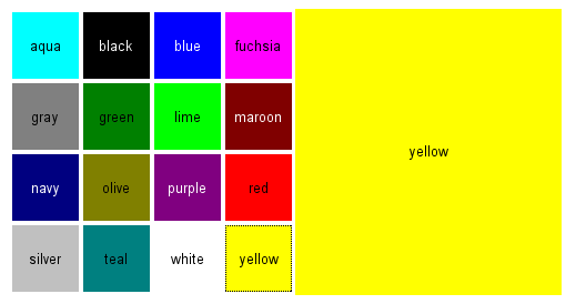
The widget will look as shown in Figure 11.6, “Color Picker Widget Without Styling”.
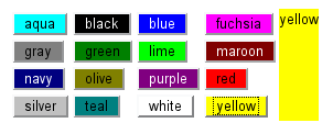
As you may notice, the widget will look rather uninviting without CSS styling. We will next look how to define a default style for a GWT widget.
GWT renders its widgets in the DOM tree of the web browser as HTML
elements. Therefore, you can define their style with Cascading Style
Sheets (CSS), just as in HTML. The GWT Compiler supports packaging style
sheets from the source package tree. The style sheet is defined in the
.gwt.xml GWT module descriptor file (see Section 11.5, “Defining a Widget Set” for details).
<!-- Default theme for the widget set. -->
<stylesheet src="colorpicker/styles.css"/>
The style sheet path is relative to the public folder
under the folder containing the .gwt.xml file. In
Eclipse, you can add the folders as regular folders instead of Java
packages.
Let us define the colorpicker/styles.css as follows.
/* Set style for the color picker table.
 * This assumes that the Grid layout is rendered
 * as a HTML <table>. */
table.example-colorpicker {
    border-collapse: collapse;
    border: 0px;
}

/* Set color picker button style.
 * This does not make assumptions about the HTML
 * element tree as it only uses the class attributes
 * of the elements. */
.example-colorpicker .gwt-Button {
    height: 60px;
    width: 60px;
    border: none;
    padding: 0px;
}

/* Set style for the right-hand box that shows the
 * currently selected color.  While this may work for
 * other implementations of the HorizontalPanel as well,
 * it somewhat assumes that the layout is rendered
 * as a table where cells are <td> elements. */
.colorpicker-currentcolorbox {
    width: 240px;
    text-align: center;
    /* Must be !important to override GWT styling: */
    vertical-align: middle !important;
}
The stylesheet above makes some assumptions regarding the HTML element
structure. First, it assumes that the Grid layout
is a table. Second, the custom class name,
colorpicker-currentcolorbox, of the right-hand
HorizontalPanel cell was inserted in the DOM
representation of the widget in the GwtColorPicker implementation. Styling
a button makes less assumptions. Using only class names instead of
specific element names may make a stylesheet more compatible if the HTML
representation is different in different browsers or changes in the future.