A simple responsive layout example without any tricks nor manipulating DOM with JavaScript.
Responsive design is used to create good user interfaces across all display sizes and devices. Generally, this means the size, position, and visibility of each section within the UI is dependent on the display size. Building responsive layouts with CSS grid allows us to easily define a grid, element positions and sizes within the grid for each breakpoint we define.
Normally if we wanted to reposition an element we would use Javascript to manipulate the DOM structure, removing and re-injecting the target element wherever we want it. With CSS grid, we can simply use CSS to tell the grid where elements should be positioned. This can be especially useful when elements must be repositioned based on the display/device size.
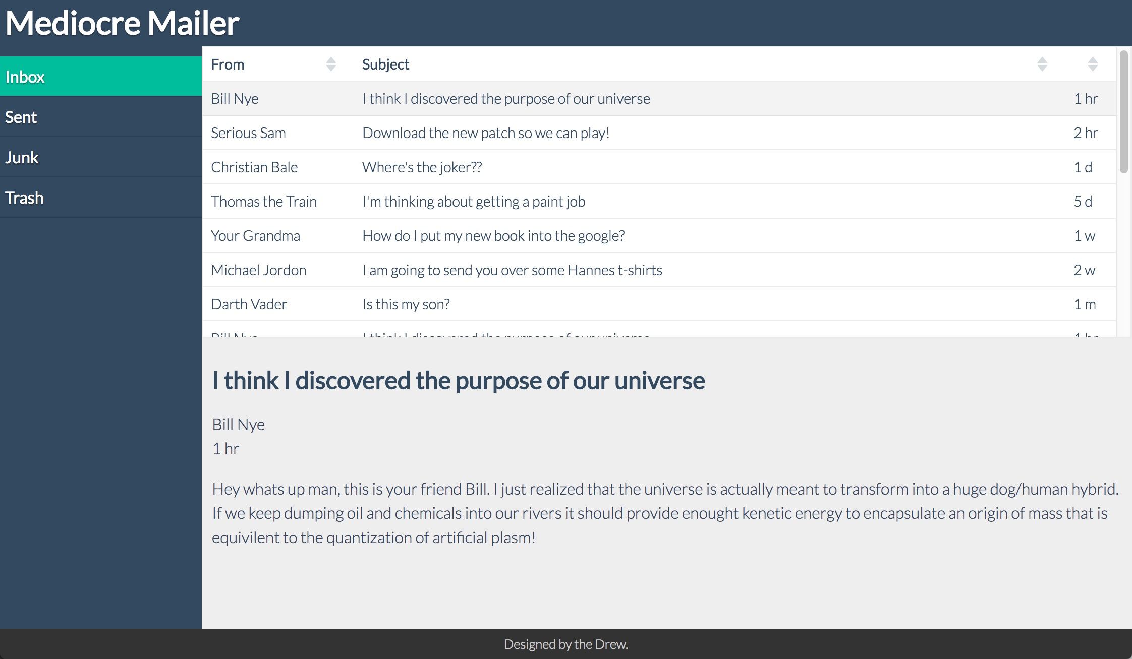
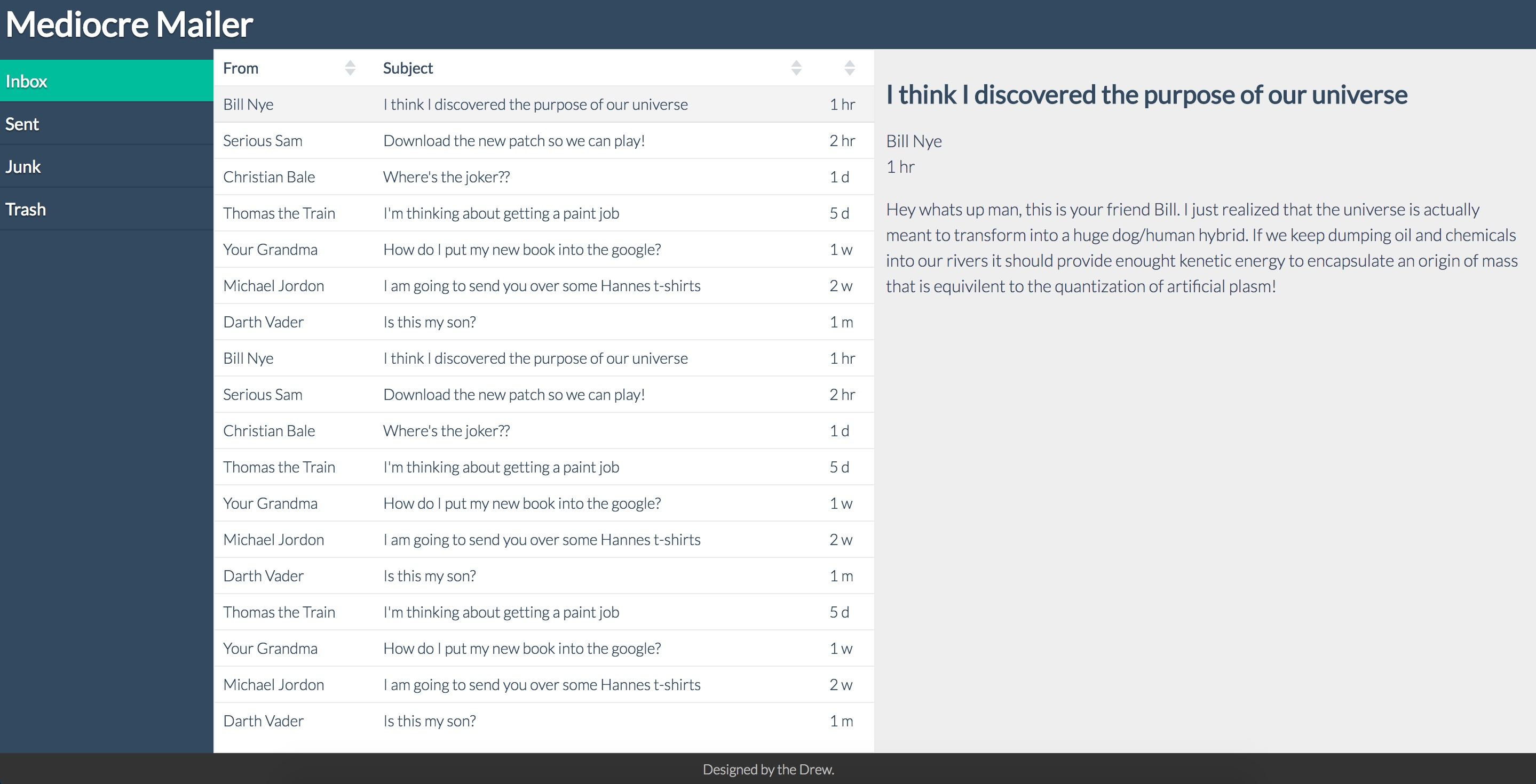
In order to demonstrate, let's walk through an example. Let's say we need to build the UI for a web email application. We have the mock-ups for small, medium, and large screens.
Small Displays:

Medium Displays:
Large Displays:
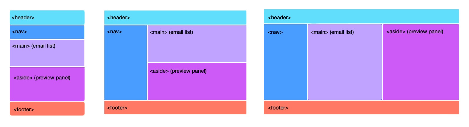
We can start out by identifying the main sections of the UI.
- header
- navigation
- email list
- preview panel
- footer
Now we can lay out our basic elements in the DOM. Anyone looking at this could easily see what the different parts of the UI are.
<!-- header -->
<header></header>

<!-- navigation -->
<nav></nav>

<!-- list of emails -->
<main></main>

<!-- preview panel -->
<aside></aside>

<!-- footer -->
<footer></footer>
Next, we need to figure out how to display these sections on different screen sizes. For this example, lets focus on small, medium, and large size screens.
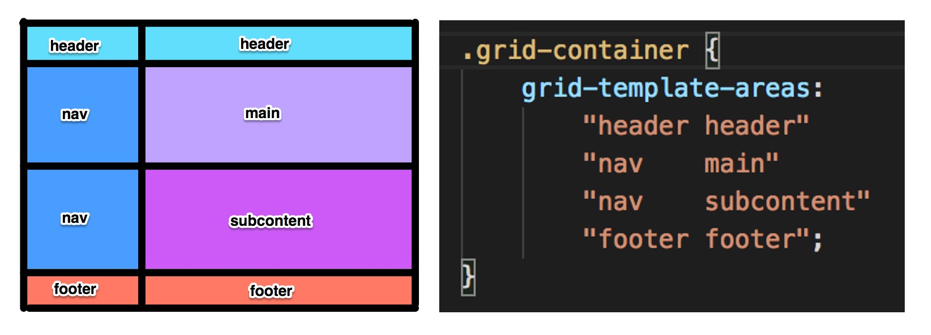
We need to draw a grid that will encapsulate all of the sections of the UI. Below you can see the grid traced by the thick black lines. The text inside each grid cell is the "grid-area" name. This name is how we can refer to sections of the grid. A grid-area can take up multiple cells.
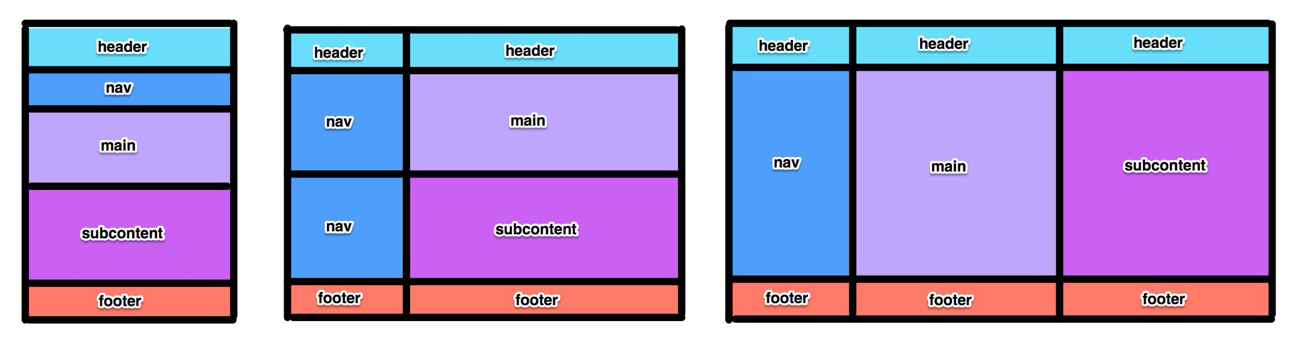
Look at the medium display example. Notice how there are two cells that are labeled "header". This is because our header grid-area takes up both of those cells. The grid-area defines and names a portion of the grid. By having this, we can simply use CSS tell the <header> element to be placed in the "header" grid-area. We could even tell the <header> element to be positioned in the "footer" grid-area and you would see your <header> element at the bottom! This is handy because it means we can change the ordering and position and size of our HTML elements with just a single CSS rule!
The CSS code almost looks identical to our visual image. Using the grid-template-areas CSS rule, we can define our grid-areas and where what cells they belong to. Below we see the visual layout right next to the CSS.
A common use case is to move, scale, or reposition elements on different screen sizes. We can use media queries and the grid-template-areas CSS attribute to set the grid-area size and positions. For this application we want the navigation to be at the top of small displays, but on larger displays, it should be on the side. We also want the preview panel to display next to the email list on wider displays. We can easily make this position by rearranging the grid-areas using the grid-template-areas CSS rule.
Define the grid areas and how they are positioned in CSS:
/* Small Screens */

.grid-container {
    display: grid;
    grid-template-areas:
        "header"
        "nav"
        "main"
        "subcontent"
        "footer";
}

/* Medium Screens */

@media only screen and (min-width: 768px) {
    .grid-container {
        grid-template-areas:
            "header   header"
            "nav      main"
            "nav      subcontent"
            "footer   footer";
    }
}

/* Large Screens */

@media only screen and (min-width: 1200px) {
    .grid-container {
        grid-template-areas:
            "header  header     header"
            "nav     main       subcontent"
            "footer  footer     footer";
    }
}
Now that we have defined how we want the grid-areas to be positioned, we need to associate our page elements with specific grid-areas. An element can specify 'grid-area' and the name of the grid-area. This will place the element into that grid-area in the layout. Note that in this example most of the element names are the same as the grid-area name. This is not required and is just to simplify the example.
header {
    grid-area: header;
}

nav {
    grid-area: nav;
}

main {
    grid-area: main;
}

aside {
    grid-area: subcontent;
}

footer {
    grid-area: footer;
}
One thing you'll notice if you use the code above is that the heights and widths of the grid are not how we want them. We need to specify the height for each row, and the width of each column.
- Row height is specified using the grid-template-rows CSS rule
- Column width is specified using the grid-template-rows CSS rule
/* Small Screens */

.grid-container {
    display: grid;
    /* sets the height of each row */
    grid-template-rows: 50px 50px auto 1fr 30px;
    /* defines the grid areas */
    grid-template-areas:
        "header"
        "nav"
        "main"
        "footer";
}

/* Medium Screens */

@media only screen and (min-width: 768px) {
    .grid-container {
        /* sets the width of each column */
        grid-template-columns: 200px 1fr;
        /* sets the height of each row */
        grid-template-rows: 50px 1fr 1fr 30px;
        /* defines the grid areas */
        grid-template-areas:
            "header   header"
            "nav      main"
            "footer   footer";
    }
}

/* Large Screens */

@media only screen and (min-width: 1200px) {
    .grid-container {
        /* sets the width of each column */
        grid-template-columns: 200px 1fr 1fr;
        /* sets the height of each row */
        grid-template-rows: 50px 1fr 30px;
        /* defines the grid areas */
        grid-template-areas:
            "header  header     header"
            "nav     main       subcontent"
            "footer  footer     footer";
    }
}
As you can see, building responsive layouts with CSS Grid is that easy. Visit this GitHub repo for the full source code to this mail application UI.
Further reading that might interest you:
Learn more about Vaadin Elements UI components for building great web apps