
The visual themes of Vaadin are the first thing any user will encounter when using a Vaadin app. Without a good theme, the user experience will decrease quite dramatically.
Vaadin takes the core themes very seriously. I'm the person in charge of the design and look'n'feel of the core themes, and I'm currently working on a new theme for Vaadin. We've usually shipped a new main theme for Vaadin in each new major release: the "corporate" theme in Vaadin 4, the default" theme in Vaadin 5, and the Reindeer theme in Vaadin 6.
The same tradition was planned to carry on with Vaadin 7, but due to some unfortunate events during the summer (me breaking my right-hand wrist), we haven't been able to finish the design of the new theme in time for the 7.0.0 release. The new theme is currently postponed to be released in 7.1. I'll outline the initial design ideas and some implementation details below. With a couple of screenshots thrown in there, of course!
Colors! Extravaganza!
With the new Sass compiler in Vaadin 7, the new theme will rely heavily on the features the compiler provides. One of the things I want to achieve with the new theme is something similar to the current Chameleon theme, but with a bit more flexibility. So by using Sass variables, you'll be able to alter the theme's color scheme with fine grained control over the hue, saturation and lightness of the main color(s) the theme is built from. Let's look at some examples (Photoshop mockups at this point only).
Let's say the built-in version comes looking like this:

But we don't like the grayish shade of blue here. We want something a bit warmer, like orange, but not too bright. We could then only modify the hue values in the theme, e.g.
  $base-color-hue: 22; // From 0 to 359
  $accent-color-hue: 22;
After a reload of the theme, we might end up with something like this:
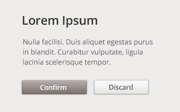
OK, a bit warmer, but the Confirm-button looks a bit dull in that color. Let's change that then:
  $base-color-hue: 22; // From 0 to 359
  $accent-color-hue: 22;
  $accent-color-saturation: $accent-color-saturation + 80%;
We increase the saturation of the accent color by 80%, and end up with something like this:

We could even reverse the colors, and have a darker theme overall (starting from the built-in version again):
  $base-color-lightness: 30%;
  $accent-color-lightness: 70%;

I hope this gives you an idea about the flexibility and ease of customization we're aiming at with the new theme. And colors won't be the only thing you'll be able to control by adjusting the theme variables.
Resolution Independence
With all the different devices we have today, and all the new ones popping up like mushrooms in the forest during this time of the year, there are many different resolutions we should be aiming for with our web apps.
The main target for Vaadin apps has been and most likely still is the more traditional desktop application like interface, but we shouldn't limit the new theme for just that use case. And with the new Retina displays now on laptop computers and soon on desktop displays, resolution independence is becoming very relevant.
So that is exactly what we're trying to accomplish with the new theme. All elements of the theme should scale nicely to any size without ugly bitmap rasterization.
This is achieved by using CSS only to style the elements. As some, who are aware of the limitations of CSS in some supported browsers, might already wonder, not all fancy gradients and shadows will work in all browsers. Some of those shortcomings will be handled using traditional image based solutions, but some things are just accepted to look different on different platforms and browsers.
More Stuff Built-In
If you've looked at the Reindeer, Runo and Chameleon theme demos, you know that many of the core themes provide multiple styles for different components. The Chameleon theme even provides what I like to call "compound styles" which let you add a style name to a set of components which transforms the group of components into a cohesive whole, defining a new component in itself.
The upcoming theme will continue this trend, and try to take it one step further. This might sound like a hefty goal, but I'll try to come up with enough styles (plain and compound) that they will be the only thing you need to build a complete, great looking application. Time will tell whether I achieve this or not.
With Sass, we can add something else built-in to the themes as well: mixins. I addition to the stuff mentioned in my previous blog post, I'm planning on including stuff like CSS animation mixins to the base theme, so you can just do the following in order to add a fade-in animation to your component:
.my-component {
    @include fade-in;
 }
Back to Implementing...
So that was a small glimpse of the new theme and it's features coming in 7.1. The theme is currently taking some of its shape in our upcoming demo application, which should reach its first public iteration before the end of the month. If you have any questions or comments, just add a comment here!