
There are numerous ways to visualize your data and Vaadin Charts comes with multiple types of graphs to choose from both for developers looking for a reliable java graph library to integrate to their Vaadin application and for the front-end developers. Despite the multitude of graphs available, it can be hard to decide which graph type fits your use case and how each of these graphs should be modified within the context of your business application.
Here are a few simple guidelines you can follow to make it easier for your end-users to read and make sense out of graphs on your UI.
-
Think about the primary purpose of the graph visualization. Is it a comparison with several values, a total sum, an average, a distribution or a change of quantitative variables. If you can define this primary purpose, it will also be easier to choose the graph type.
-
Use pie charts to show parts of the whole. Unless the parts don’t sum up, or you want to extensively compare parts, the pie is not the right choice and you should use for example bars or something else instead.
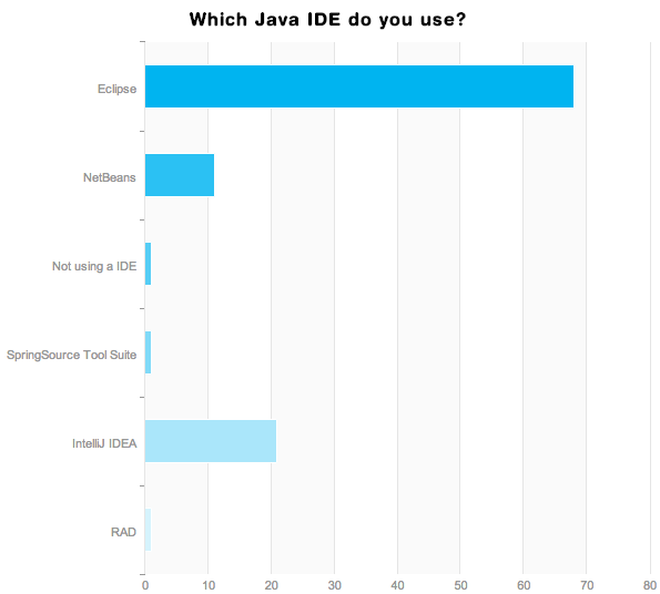
People use multiple IDEs so a pie chart would not make any sense. -
Use a line chart when you want your users to find trends. When lines are used to display data, the reader can better focus on the pattern that they form.
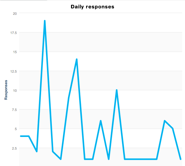
Response rate slows down over time.
-
Bar graphs are good for comparisons. Bars help people focus on the magnitudes of individual variables and allow easy comparison.
-
Remember that it is easier for people to compare lengths than areas. This is why a bar chart still makes sense over many area-coded visualizations.
-
Try to avoid vertical titles. They save space, but make it much harder to read the graph.
-
Use effects sparingly. Flat might be boring, but if the target is to understand the data instead of advertising it, simpler solutions are a safer choice. Avoid shadows and 3D effects unless your information is boring.
-
Sort your data in a meaningful way to make it more readable. This is clear when using time based data, but whether you are using a pie, a bar or a line chart, order helps focus and comparison. What is the first thing you want people to read?
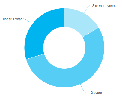
Clockwise sorting would be more intuitive. -
Combine charts side by side. Instead of using multiple series in one bar chart, put them into two bar charts next to each other and only use single labels. This is a good approach when searching causality between the series, rather than just comparing them.
-
Use different gray levels and a single highlight color. Your palette is virtually infinite, and you can be creative, but avoid using too many colors. Two to five should be enough. Remember that not all people can see all the colors.
These only cover the most common chart types Vaadin Chart provides, but as you go further, you notice the same principles apply to more sophisticated chart types as well.
Would you like to learn more about how to plot graphs that bring value to your web apps in Java or HTML? Check out Vaadin Charts features and APIs both for Java and HTML and give it a free trial on your favorite IDE including Eclipse and IntelliJ
You can also watch our webinar on Getting Started with Vaadin Charts in Java in which we explain how to use Vaadin Charts to plot good looking and readable graphs in Java.
PS. or ‘one more thing’: We have covered PDF generation, printing and document management integration earlier. Take a look at how to fully benefit from vector-based charts.